


How to get dressed using colour theory
PHOTOGRAPHY BY TOBIAS ROWLES
WORDS BY CAROLINE zielinski
Colour me happy.
Artists have always known about it. Chances are, you’ve seen one floating around at school, your kid’s classroom or even at Officeworks. It’s the colour wheel: a round, multi-coloured, multi-toned and multi-hued (yes, they’re all a different thing, keep reading!) device with a central point and a series of colours arranged around it, spanning out.
Half the wheel consists of warm colours (yellow, red, orange); the other half cool (so your blues, purples and greens). A visual representation of the colour spectrum that allows us to understand how colours relate to each other and how they can be combined or contrasted, the colour wheel is a very useful tool in about every part of life that includes, well, working with colour.
For more fashion news, shoots, articles and features, head to our Fashion section.
And now its usefulness has bled into the fashion world – or, at least, into TikTok’s fashion world – reinvigorating our collective fascination with colour analysis, theory and coordination. In fact, it’s become so popular that a filter designed to help people ‘try out’ colour combinations digitally has gone viral. But how do colour analysis and the colour wheel look when it comes to getting dressed each day and is it achievable for the mere mortal?
What is colour theory?
“Colour theory is not a new concept – it’s been around for centuries. Isaac Newton created the first colour wheel, and it continues to be used by many as practical guidance for colour mixing and combination,” says Donna Cameron, stylist and author of Colour: The Secret to Creating a Sustainable Wardrobe. Donna, who’s been in the business for 11 years, regularly performs colour analysis for her clients. It is, in fact, the first thing she does as without it, one may as well be lost in a sea of kaleidoscopic fabric.
“When I analyse someone, I take in their hair, eye colour and skin tone, and consider the following: value, chroma and hue,” she tells me. Value, Donna explains, indicates the depth or lightness/darkness of a colour, with white as the lightest and black as the deepest. Chroma refers to the strength of colour or its saturation. “Think about the strength of cordial. If you pour a lot of it in, you’ll have an intense colour but if you pour less, you’ll be looking at a softer, less saturated colour,” she explains.
Then finally, there’s the hue, which signifies the name of the colour family, so blue or red etc. “For example, is the hair black or purple – two strong colours – or more of a mousy brown, a soft blonde?” Donna says. Depending on the hair colour, skin tone and skin temperature – “people are predominantly warm or cool” – she will be able to tell what sorts of colours will enhance someone’s appearance, or dull it.
You can literally make someone’s face glow when you put the right colour on them – I’ve seen it! If you’re unsure what skin tone you have, grab a pure white piece of clothing or a piece of white paper, and hold it up to your face in bright, natural light. If your skin looks pink or rosy by comparison, you’re cool-toned. If your face looks more yellow, your undertone is warm.
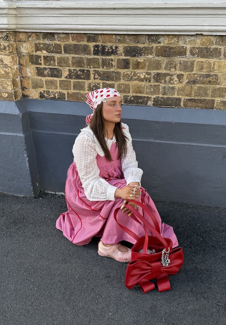
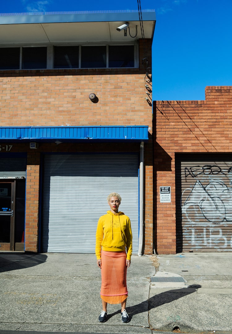
Colours that look good together are called a colour harmony. Some examples of this include complementary colours (those that appear on opposite sides of the colour wheel, like blue and red, resulting in high contrast colour combinations); monochromatic (three shades, tones and tints of one base colour); analogous (three colours next to each other on the colour wheel, which can be overpowering if not well thought out); tetradic (when four colours are evenly spaced on the colour wheel – they work best if you let one colour be dominant and use the others as accents); and triadic (three colours that are evenly spaced on the colour wheel).
If you’re new to colour theory, Canva has a cool digital colour wheel you can play with to get different colour combinations. For Donna, knowing which colour combinations work well with the person’s skin and hair has become almost intuitive. “When we get dressed, we want to be the feature and the clothes be the supporting act. We don’t want to be dressing in a colour that overwhelms or underwhelms us,” she tells me.
So, how does it work with clothes?
Generally speaking, people with cooler skin tones look best in colours on the ‘cool’ part of the colour wheel: think variations of blue, green, purple and pink. Those with warm skin tones (Donna points out there is a continuum from very cool to very warm – just see how many foundation shades there are) tend to suit the more earthy tones of copper, brown, mustard yellow and warm reds.
Knowing what colour suits us and which doesn’t also help when it comes to figuring out which trends to follow. For Donna, seeing Melbourne turn into a sea of black at the cusp of winter is a prime example of people blindly following fashion tourism rather than trying out what actually works for them.
“Black is a deep value, highly saturated and very strong colour – a cool neutral – and it’s just not for everyone,” she explains. “I see so many Melbourne women wear black because they think it’s flattering, that it’s easy to wear. But that’s not always the case. Wearing such a harsh colour can cast more shadows on your face, highlight jowls and the bags under the eyes.”
Instead, she advises other dark colours, like chocolate browns, olives and a warm burgundy, as replacements, especially for people with warmer complexions. “It can make a world of difference, just changing out dark,” Donna points out.
Colours can impact and influence mood
Colour theory also goes hand-in-hand with colour psychology (how colour impacts emotion and conveys feeling). Colour is more than ornamental – it can dramatically affect moods, feelings and emotions. Depending on where we’re going and what we want to evoke, the colour we choose to wear will tell a story for us.
“Different colour combinations are appropriate for different situations,” Donna explains. “There are ideal colours to wear in a professional setting, that are different, for example, than for a party setting, a creative setting.”
Certain schemes can also make someone look more or less approachable, something that’s a consideration when meeting someone’s parents or working with children, she says. “You probably wouldn’t wear a hot red dress to meet your boyfriend’s parents for the first time.”
But as is often the case with creative pursuits, sometimes knowingly breaking the ‘rules’ of colour theory can yield surprisingly fun results. “In the end, beauty is in the eye of the beholder,” Donna tells me. “Yes, some colours do enhance certain features, but it all depends on the look you want to achieve and the effect you want to have. Jarring colour combinations may look less harmonious than an all-neutral palette, but they have a much stronger impact.”
To find out more about Donna’s colour analysis services, head here.
Liked this? You’ll love these...