


Netflix accused of changing movie posters to match your ethnicity
Screenshot via @slb79
“Clumsy at best and offensive at worst.”
It’s no secret Netflix picks and chooses which film artwork it shows in your menu. In fact the streaming giant even shared a blog post last year about the way it tries to get its titles to appeal to you.
But now, some Twitter users have called out the service for selecting artwork based on their ethnicity, presenting films with predominately white leads to look like they centre around black characters.
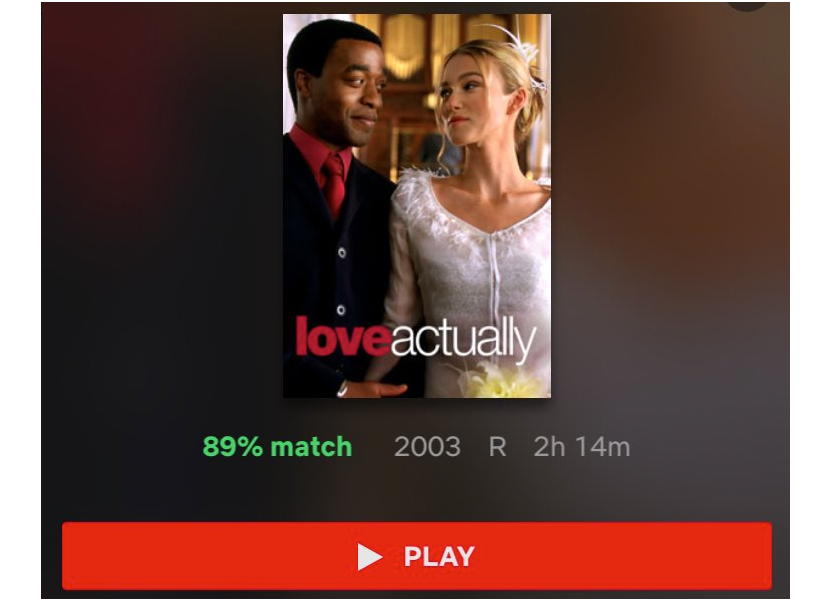
Case in point: a poster for Love Actually, which to some viewers is presented to look like a love story between Chiwetel Ejiofor and Kira Knightly (who both have relatively minor roles).
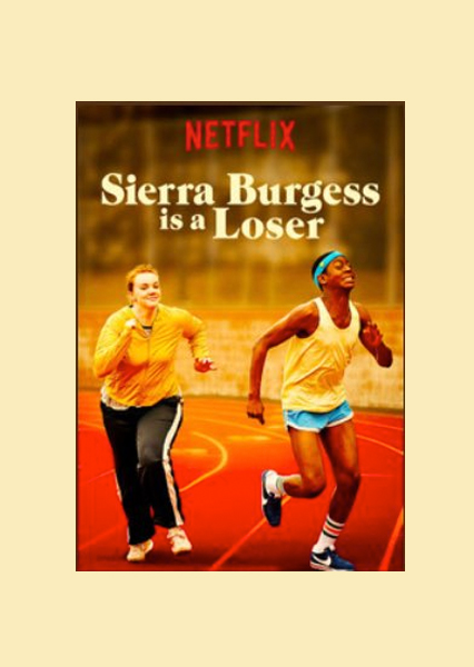
Users also reported seeing altered posters for films like Sierra Burgess is a Loser and Like Father, the second of which has incredibly minor roles for its black characters.
“Yes, when I’m scrolling through, looking for what to watch, I instinctively stop when I see black characters highlighted as the lead as that’s what I want to watch,” founder and editor of MelanMag.com (a publication for women of colour), Joy Joses, told Sky News. “It’s beyond deceptive to think that I am being manipulated based on my so-called algorithm choices. It really is an own goal though, as audiences have caught on.”
In response to the claims, a Netflix spokesperson said:
You can check out some of the comparisons below.
Other Black @netflix users: does your queue do this? Generate posters with the Black cast members on them to try to compel you to watch? This film stars Kristen Bell/Kelsey Grammer and these actors had maaaaybe a 10 cumulative minutes of screen time. 20 lines between them, tops. pic.twitter.com/Sj7rD8wfOS
— stacia l. brown (@slb79) 18 October 2018
Just did another cursory scroll of suggested watches and the posters they gave me. pic.twitter.com/VoCFJQfWaK
— stacia l. brown (@slb79) 18 October 2018
Just to add my white data point, these are the thumbnails I see for some of the same movies you shared. pic.twitter.com/GjapwcdQuD
— Kelly Quantrill (@codetrill) 19 October 2018
Liked this? You’ll love these...