


Pantone’s colour predictions for 2018 are here
Our colour overlords have spoken.
As of this week, 2017 is old news to Pantone, which means it’s old news to the rest of us too.
The colour overlords have just released their colour predictions for 2018, so get your pens at the ready.
The predictions come from Leatrice Eiseman, the Executive Director of the Pantone Color Institute (dream job).
They follow months of studying fashion runways, art, TV, movies, architecture, retail, theatre, food and consumer goods around the world.
Clearly, Leatrice is a wizard, so we’re going to take these predictions as 100% fact.
Fact one: shiny is in
“Metallics, we know, are classic but they have really moved over into neutrals,” she told Home Accents Today.
She also noted an ongoing fascination with anything iridescent, pearlised, or translucent.
Fact two: see ya, pastels
We’ll be moving away from pastels like last year’s Serenity and Rose Quartz in favour of brighter, bolder shades.
“Intense colours seem to be a natural application of our intense lifestyles and thought processes these days,” said Eiseman.
Fact three: ’70s fever is alive and well
The 1970s trend will stay strong, with a whole lotta fringing on the way.
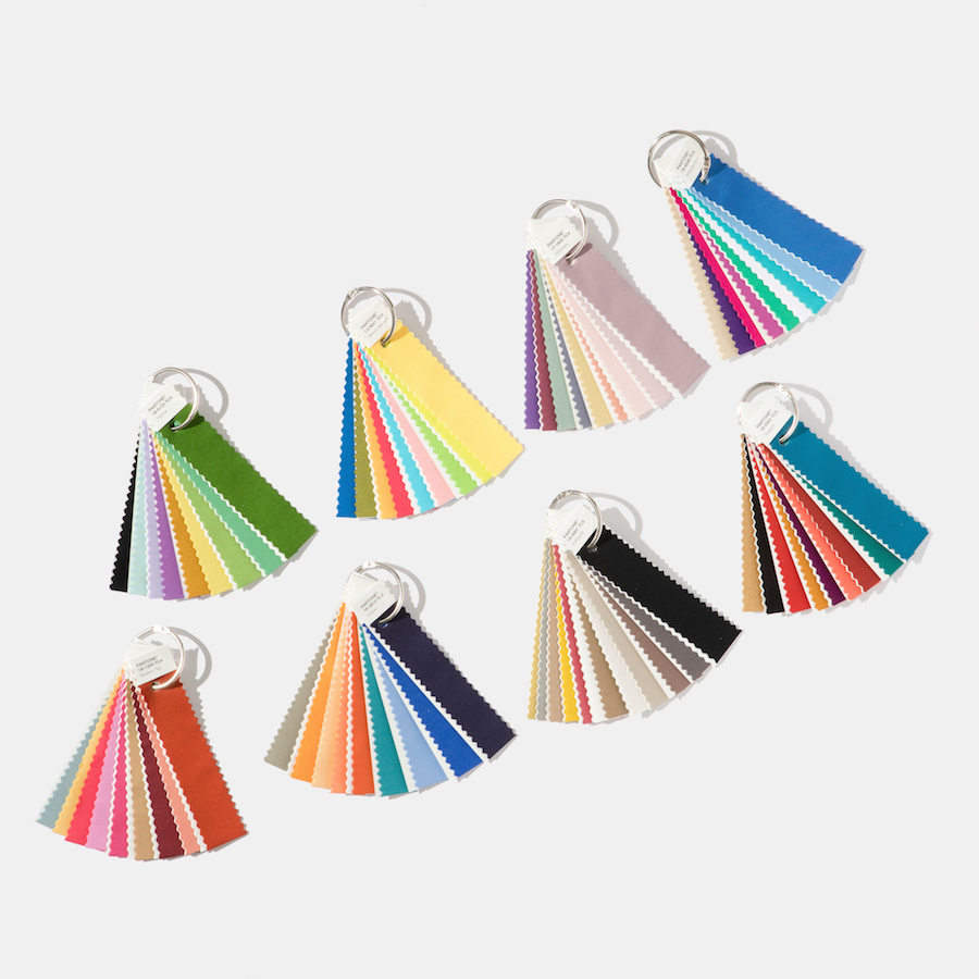
We’ve also compiled a quick wrap-up of Pantone’s eight colour palettes you can expect to see in 2018.
Verdure: Symbolic of health. Think vegetal, colours like celery and foliage, combined with berry-infused purples and eggshell blues.
Resourceful: This palette aims to be clever by refurbishing what you already own. Matching complementary colours on the colour wheel like oranges and blues, in a mix of warm and cool tones.
Playful: “Bright-hearted more than light-hearted,” according to Eiseman. Colours like Minion Yellow, Lime Popsicle, Green Flash and Blue Skydiver.
Discretion: Low-key and subtle. This palette features hues such as Elderberry, Burnished Lilac and Hawthorne Rose. It’s pretty much the opposite of Playful.
Far-fetched: Combines three popular rosy tones with Iced Coffee and Ruby Wine, as well as earthy tones like Cornsilk Yellow.
Intricacy: Reflects the popularity of intricate designs. Features the ‘new neutrals’ or metallics.
Intensity: An eclectic mix of colours to convey “strength, power and sophistication.” Composed of cool shades of plum and blue, matched with fiery tones of orange and gold.
TECH-nique: A nod to the proliferation of technology, this palette features hues that seem to “shine from within.” They include vibrant blue and green, fuchsia and purple, along with peacock tones in turquoise.
Liked this? You’ll love these...